CI 소개
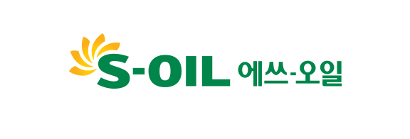
S-OIL의 로고는 'S'에 시각요소를 두어 브랜드 커뮤니케이션을 강조한 싱글 포인트 마크타입(Single-Point Mark Type)으로 개발되었습니다.
'S'를 중심으로 뻗어나가는 5개의 햇살(The Five Rays)은 아침의마음(Warm Heart)을 담고 있습니다. 5개의 햇살 아이콘은 'S'와 함께 조화 되어 S-OIL의 특별한 가치 (A Speciality Value)를 강조하고 있습니다.
로고타입
시그니처
국문 - 좌우조합
국문 - 좌우조합
전용색상
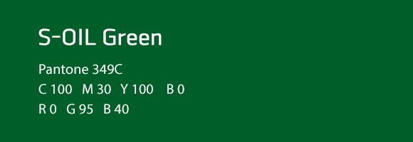
S-OIL Green
S-OIL의 로고타입은 Green 컬러로 표현하여 소비자 지향적이며 환경친화적 이미지를 전달하고, S-OIL Yellow와 조화를 이루고 있습니다.
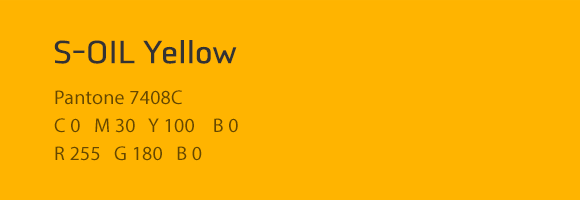
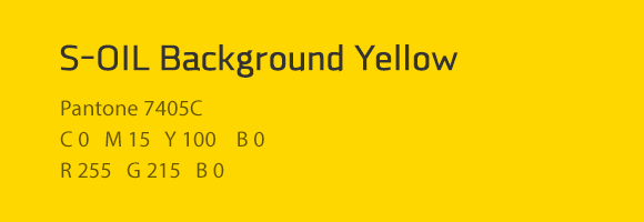
S-OIL Yellow, Background Yellow
5개의 햇살(The Five Rays)은 중심부로부터 서서히 퍼져가는 Yellow Gradient로 햇살 이미지를 입체적으로 표현하고 있습니다.