CI
S-OIL's new logo adopts a single-point mark type that stresses brand communication with a visual focus on the capital letter "S". The five rays that stretch out from "S" singnify 5S-SPIRIT, a set of values shared among all S-OIL employees, and express S-OIL's warm heart to come close to customers through an image as fresh as the morning sun. The five ray icon harmonizes with "S", thereby emphasizing the specialty value that S-OIL has.
Logotype
Signature
KOREA
ENGLISH
Color
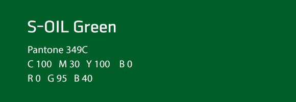
S-OIL Green
S-OIL’s logotype is colored green to give visual impact to the new logo and seek harmony with S-OIL’s brand color, yellow. The green color also represents S-OIL’s consumer-oriented, environment-friendly image.
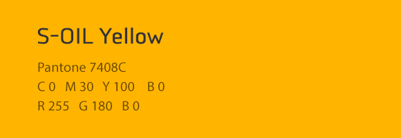
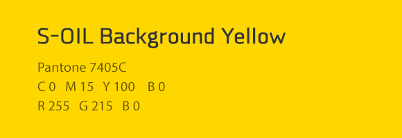
S-OIL Yellow, Background Yellow
With the five rays colored yellow, the existing brand color of S-OIL, this new logo only preserves S-OIL’s brand image but also differentiates S-OIL from rival brands.